Visualizations
A collection of shorter projects
A collection of shorter projects
A way of visualizing particle spectra data that is simulatneously mathematically elegant and practical.
One common problem plaguing experimental physicists is the visualization of spectral data. Take gamma spectroscopy, for example. After acquisition, we'd end up with a spectrum with a finite number of discrete bins representing a continuous spectrum. The number of counts in each bin follows its own Poisson distribution.
Physicists are then often faced with the problem: how do we visualize this spectrum, when some parts of the spectrum bins have several thousands of counts per bin, while others have less than one count per bin?
We often use the off-the-shelf solution: applying log-scale. But this deminishes the peaks' apparent prominence at high-count-rate parts (left side of the figure below) of the spectrum, and make the low-count-rate parts of the spectrum seem noisier than it actually is.
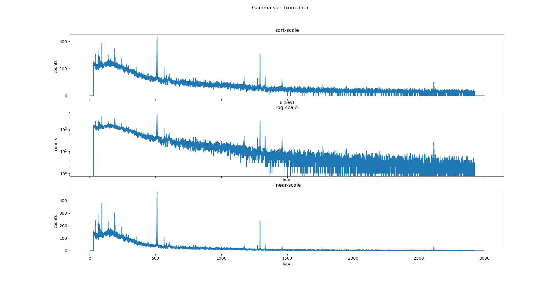
Figure 1: The same spectrum plotted in all three scales, side-by-side.
What I propose is to use the sqrt-scale. Assuming that each bin in the spectrum follows a Poissonian distribution, then the variance = counts = σ2, and standard deviation = σ = sqrt(counts). As a result, this gives us the following advantages:
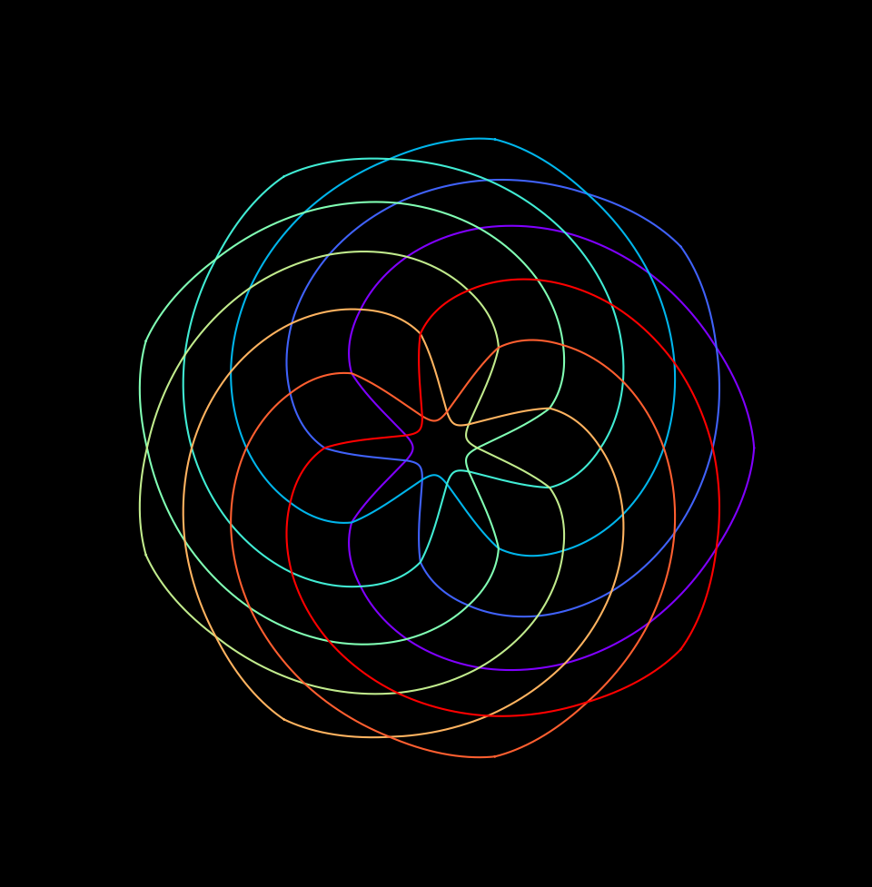
A Venn-diagram-like art
Velocity and trajectory of a malfunctioning rocket
Have you ever wondered what happens if we launched a rocket, and it started spinning out of control, what kind of path will it trace out?
Well, wonder no more! You can find out for yourself using this jupyter notebook!
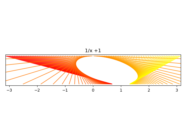
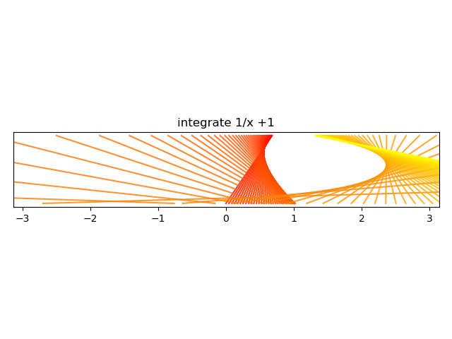
An alternative way of plotting a function
We are used to seeing functions represented by a graph: plotted on a grid of cartesian coordinates, where x = input, y = output. However, there is an alternative way fo plotting a function: make two parallel number lines, and draw arrows between them.
The number line at the top is the input, the number line at the bottom is the output. This led to the creation of the following wonderful and beautiful plots:
).png)
).png)
.png)
.png)
.png)
.png)
.png)
+x.png)
+x.png)
Visualizing bifurcation
The logistic map
xn+1 = r(1-xn)xn
converges quickly to a stable value of x when we iterate from any initial values of x0 when r is 3.
However, it no longer converges onto a single value when x is larger than 3.
This project investigates this behaviour more closely.
You can try this for yourself at this jupyter notebook, and play around with the code as well.
The source code to generate this video is found on my GitHub repo.
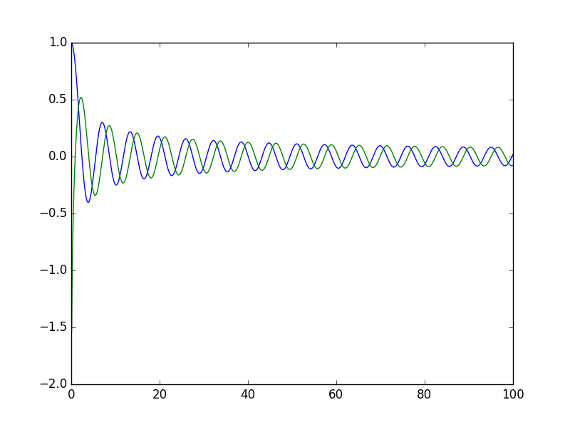
How does a wave of an arbitrary shape propagate across a light and infinitely flexible string
In an ideal world with ideal strings, the wave on a length of string fixed at both ends should oscillate forever without losing energy. How would such a wave evolve over time?
A rounded triangle wave.
A sawtooth wave.
A small square wave (duty cycle = 20%).
A custom, hand-drawn wave.
You can find the codes that generated these videos at my GitHub repo.
Programming is also a useful way of generating specialized functions/interesting curves.
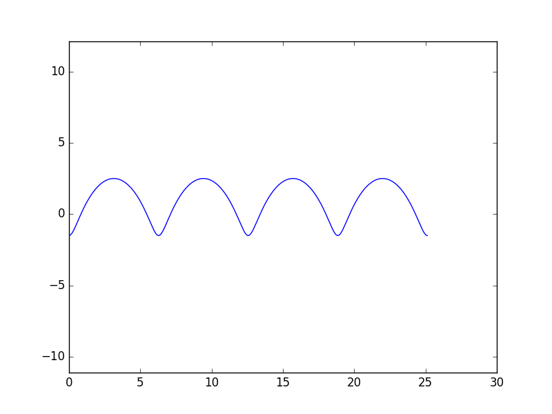
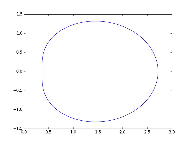
Curtate cycloid
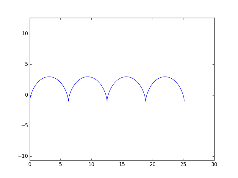
Normal cycloid
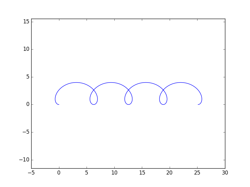
Prolate cycloid
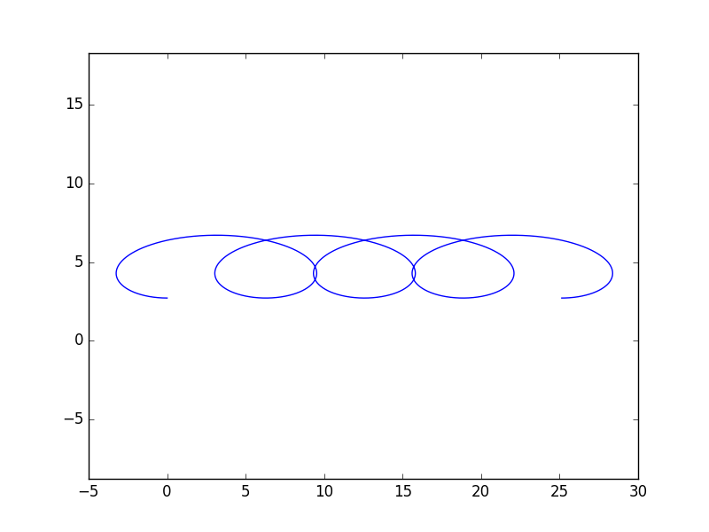
Very prolate cycloid (drawing arm is 6π/4 times the length of the radius).
exp(exp(i*x)) on the Argand diagram, for x between 0 to 2 π.
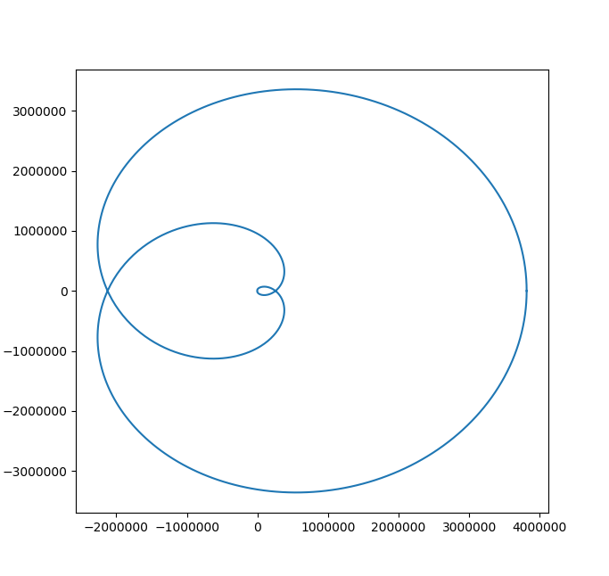
exp(exp(exp(exp(i*x)))) on the Argand diagram, for x between 0 to 2 π.
The two branches of the Bessel function.
You can find the code that plotted all of these at my GitHub repo.
ii and other interesting maths with complex numbers
Did you know that the imaginary number i (where i2=-1), raised to itself, ii=0.20788, which is an entirely real number? In fact, any complex number z with |z|=1, raised to any purely imaginary power, it will always give a real number.
You can find out why in this report.
(Inspired by a 3blue1brown's lockdown math video.)
Demystifying the Mohr's circle
Engineers have to learn about how shear stress and principal stress are related using the Mohr's circle. There are two approaches to doing so: rote learning (memorizing what mathematical operation to do with using the Mohr's circle) or intuitively understand why the Mohr's circle is used like so.
As an advocate for understanding rather than blindly execution, I made a project on this, which you can find as a jupyter notebook.
Sometimes science is nice and beautiful. Sometimes science is ... hairy.
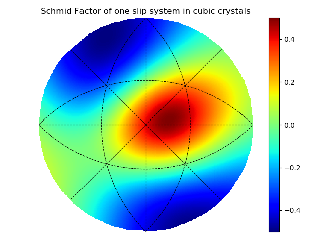
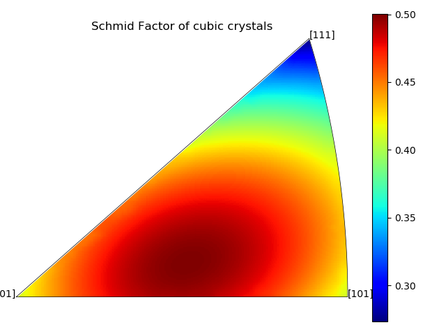
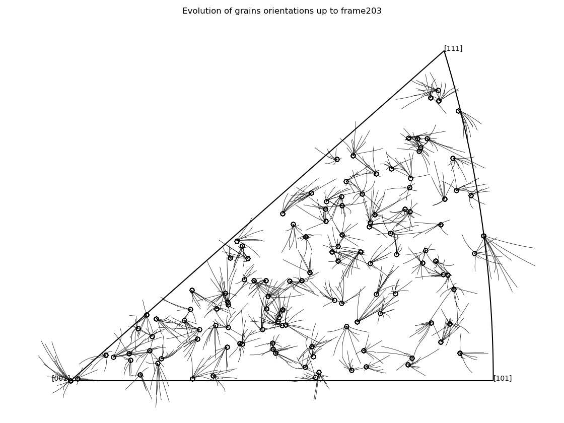
Materials Science rarely generate aesthetically pleasing plots; so I've cherry-picked only three out of the many plots that I have created from my materials science projects.
These are what's known as "Pole Figures", which can be used to mark the orientation of a crystal in 3D space. The first two heatmaps plot the Schmid factor, which states how much will a grain deform if it is oriented in that specific orientation. The third plots the evolution of a dozen grains' orientations throughout a few FEM simulations.
Day science employs reasoning that meshes like gears... One admires its majestic arrangement like a da Vinci painting or a Bach fugue. One walks about it as in a French formal garden...
Night science, on the other hand, wanders blindly. It hesitates, stumbles, falls back, sweats, wakes with a start. Doubting everything... It is a workshop of the possible... where thought proceeds along sensuous paths, tortuous streets, most often blind alleys.
- Francois Jacob, 1965 Medicine Nobel laureate
Experimental data analysis and plotting were done using Python
Python is also a powerful tool for plotting and fitting experimental data. For the most part, the codes in this repository are written for myself and therefore are not external-user friendly.
However, I am still excited to show you one of the prettier plots I've generated using them.
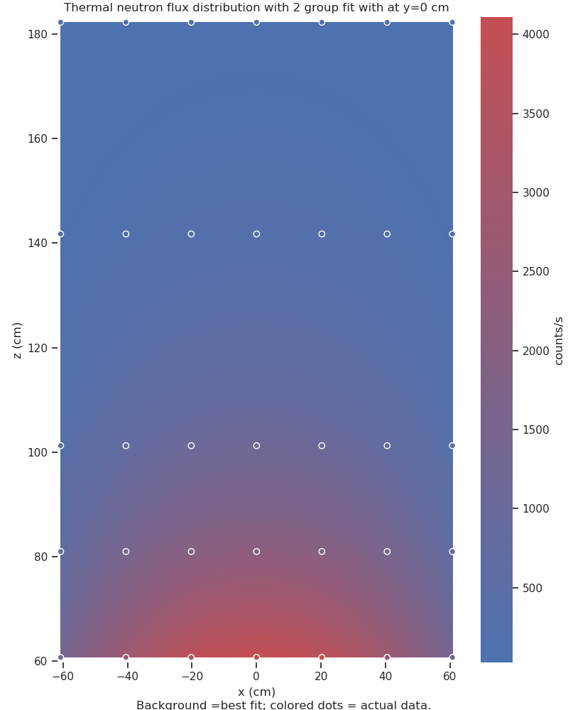
The plot above shows the thermal neutron flux variation across a graphite stack in the basement of the physics building: as you can see, a neutron source was placed at the bottom, but neutrons stream across the entire 2+ meters tall graphite stack.
The circles are the locations where the neutron flux are measured; they are coloured according to their measured neutron flux. Using these data points, a best-fit model of the neutron source intensity across the entire graphite stack was generated. This model is plotted onto the background, colouring in the rest of the graphite stack at locations where no neutron flux measurements had been taken.
Updated video